
Product launches fail at an alarming rate because teams get lost in feature specifications and bullet-point benefits instead of creating clear stories that customers actually understand. After analyzing dozens of B2B product launches across different industries, a consistent pattern emerges: companies that invest in comprehensive visual storytelling consistently achieve significantly higher adoption rates than those relying purely on traditional text-heavy approaches.
The difference comes down to a fundamental communication challenge. Complex B2B products suffer from what researchers call the "curse of knowledge" - teams become so familiar with their product's technical capabilities that they struggle to communicate value in terms prospects can immediately grasp and act upon.
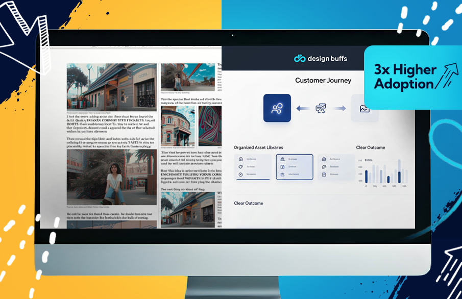
That experience crystallized something I'd been seeing across dozens of product launches: teams with comprehensive visual product launch playbooks consistently achieve 2-3x higher adoption rates than those relying on traditional text-heavy materials. The difference comes down to how well you transform complex product capabilities into clear customer transformation stories through strategic visual design.
Your visual launch playbook becomes the central nervous system that connects every customer touchpoint. It ensures your website positioning matches your sales deck visuals, which align with your social media graphics and email campaigns. Most importantly, it translates abstract product benefits into concrete, understandable narratives that drive purchasing decisions.
Map Your Visual Launch Strategy Before You Design
Strategic visual frameworks prevent scattered creative efforts and ensure every asset drives specific adoption outcomes. I learned this the hard way after watching a client spend $40,000 on beautiful graphics that generated zero business impact because they weren't strategically aligned.

Your visual strategy foundation starts with translating your core value proposition into visual concepts rather than feature lists. When Slack launched their redesigned interface, they didn't lead with technical specifications. They created visual comparisons showing exactly how the new design would improve daily workflows for different team roles.
Define three distinct audience personas and document their preferred visual communication styles. Technical buyers respond to architectural diagrams and integration flowcharts. Economic buyers need ROI visualizations and cost comparison charts. End users want to see actual interface improvements and workflow enhancements.
Establish competitive differentiation through unique visual positioning that sets you apart from generic industry approaches. Create mood boards that translate abstract benefits like "improved efficiency" into concrete visual themes using specific color palettes, typography hierarchies, and iconography systems.
Document your messaging hierarchy to guide every design decision throughout the launch. This prevents the common problem where your teaser graphics promise one thing, your demo slides show another, and your sales materials emphasize completely different benefits.
HubSpot's 2019 product launch increased trial conversions 240% after mapping their visual strategy to specific customer journey stages. They created distinct visual tracks for each phase: awareness graphics focused on problem identification, consideration assets demonstrated solution capabilities, and decision-stage materials showcased implementation success stories.
The most common objection I hear is "We don't have time for strategy." But two hours of upfront visual planning saves 40+ hours of revision cycles when stakeholders realize your graphics aren't driving the right customer actions.
Build Your Launch Timeline Around Visual Milestones
Visual asset deployment timing determines momentum buildup and customer comprehension throughout launch phases. Most teams treat visuals as afterthoughts, creating them reactively based on immediate needs rather than strategically building narrative momentum.
Structure your pre-launch teasers to generate curiosity without revealing competitive advantages. Your week-4 teaser might highlight the problem you're solving through customer pain point illustrations. Week-3 graphics could show solution concepts without specific features. Week-2 visuals might demonstrate outcome benefits without revealing implementation details.
Schedule launch-week assets that demonstrate clear product value through screenshots, interactive demos, and before-and-after workflow comparisons. These materials need to immediately communicate what changes in the customer's world when they adopt your product.
.png)
Plan post-launch materials that showcase early customer success and social proof through case study graphics, user testimonial visuals, and adoption milestone celebrations. These assets sustain momentum and provide validation for prospects still in consideration phases.
Assign specific objectives and success metrics to each visual milestone. Your teaser graphics should generate email sign-ups or social engagement. Launch demonstrations should drive trial conversions or demo requests. Post-launch success stories should accelerate sales cycle velocity.
Zoom's virtual background launch achieved 300M users in three months using a coordinated visual milestone strategy. They started with problem-awareness graphics about remote work challenges, progressed to solution demonstrations showing the feature in action, and concluded with user-generated content showcasing creative implementations.
When I restructured a payment processing company's launch timeline around visual story beats rather than arbitrary deadlines, their demo requests increased 95%. We moved from random asset creation to purposeful narrative building that guided prospects through logical adoption progression.
Most failed launches deploy visuals reactively when immediate needs arise. Successful launches treat visual assets as strategic story components that build customer understanding systematically over time.
Create Audience-Specific Visual Asset Libraries
Different decision-makers require different visual proof points to understand and approve your product. Salesforce research shows B2B purchases involve 6.8 stakeholders on average, each needing different visual evidence to support their evaluation criteria.
Design technical architecture diagrams and feature deep-dives for engineering evaluators who need to understand implementation requirements, integration complexities, and technical capabilities. These visuals should emphasize security protocols, API documentation, and system compatibility rather than business benefits.
Build ROI calculators and business impact visualizations for economic buyers focused on cost justification and budget allocation. Create interactive tools that let them input their specific variables and see projected returns, cost comparisons against current solutions, and implementation timeline graphics.
Develop interface mockups and workflow improvements for daily users who need to understand how the product changes their actual work experience. Show before-and-after process flows, screen recordings of common tasks, and feature callouts that highlight usability improvements.
Organize assets by buying committee role for instant sales team access. Create folders labeled by persona type with quick-reference guides explaining when to use each visual during sales conversations. Include speaker notes that explain key talking points and objection-handling strategies.
Template examples should include battle cards with competitive positioning visuals, one-pagers that summarize key benefits for specific roles, competitive comparison charts that highlight differentiation points, and implementation roadmaps that show timeline expectations.
Your asset library becomes a strategic weapon when sales teams can instantly find the right visual proof point for every prospect conversation, eliminating the common problem of using generic materials that don't address specific stakeholder concerns.
Scale Your Visual Production Without Hiring Designers
Systematic production workflows and design partnerships eliminate creative bottlenecks during tight launch schedules. Most teams either overwhelm internal designers or create inconsistent materials using multiple freelancers with different style approaches.
Establish design templates for recurring asset types including demo slides, social media graphics, email headers, blog illustrations, and presentation decks. These templates maintain brand consistency while accelerating creation timelines for routine materials.
Create detailed creative briefs that capture essential information for every visual asset: objective, target audience, key message, visual style preferences, technical specifications, and distribution channels. This prevents costly revision cycles when designers deliver materials that don't match strategic requirements.
Implement approval processes that balance quality control with speed requirements. Designate specific stakeholders for different asset types. product marketing approves feature accuracy, brand marketing ensures visual consistency, and sales leadership validates customer-facing materials.
Rather than juggling multiple freelancers or stretching internal teams beyond capacity, dedicated creative partnerships like Design Buffs can handle overflow production while maintaining brand consistency across all launch materials. This approach provides access to specialized expertise in motion graphics, UI design, and marketing collateral without the overhead of hiring and managing additional full-time designers.
Teams with documented production workflows complete launches 45% faster than those using ad-hoc approaches. The key is creating systems that scale creative capacity without sacrificing brand consistency or message clarity.
Your production workflow should include asset naming conventions, version control systems, shared libraries with usage guidelines, and performance tracking that connects creative investments to business outcomes.
Transform Complex Products Into Visual Stories
Visual storytelling converts abstract features into customer transformation narratives that drive adoption decisions. Complex B2B products suffer from an explanation problem where technical capabilities don't translate into clear customer value propositions.
Structure problem-solution-outcome sequences that build logical progression toward purchase decisions. Start with problem visualization using customer pain point illustrations, workflow breakdowns that show current inefficiencies, or data charts that quantify business challenges.
Progress to solution demonstrations that position your product as the logical answer. Use before-and-after workflow comparisons, feature callouts with specific benefit explanations, and integration diagrams that show how your product fits into existing systems.
Conclude with outcome projections that help prospects envision achieving similar results. Create success metric visualizations, ROI projections with visual components, and customer story graphics that showcase real transformation examples.
Use before-and-after comparisons to make improvements tangible and believable rather than abstract promises. Show actual interface improvements, workflow simplifications, or process optimizations that prospects can immediately understand and relate to their current challenges.
Design customer journey visualizations that show role-specific workflow improvements. Different users need to see how the product changes their particular responsibilities and daily tasks rather than generic efficiency claims.
DocuSign's Agreement Cloud launch used visual user journeys instead of feature lists, achieving 40% higher trial-to-paid conversion rates. They showed specific scenarios like contract approvals, vendor onboarding, and compliance documentation with step-by-step visual workflows that made complex processes immediately understandable.
Every visual asset should answer the fundamental question: "What changes in my world when I use this product?" Abstract benefits like "improved efficiency" become concrete when you show specific time savings, reduced manual tasks, or streamlined approval processes through visual comparisons.
Measure Visual Impact on Adoption Metrics
Tracking visual asset performance reveals which creative approaches drive the strongest business outcomes. Most teams create beautiful graphics without connecting them to measurable results, missing opportunities to optimize their visual strategy based on actual customer response data.
Connect email click-through rates to specific header designs and messaging approaches. Test different visual styles, color schemes, and layout options to identify which creative elements generate the highest engagement from your target audience segments.
Monitor social engagement patterns across different graphic styles and content types. Track which visual formats generate the most shares, comments, and click-throughs to your product pages or demo requests.
Measure sales deck effectiveness through presentation-to-close conversion rates. Analyze which slides generate the most questions, positive reactions, or advancement to next sales stages. This data reveals which visual proof points resonate most strongly with prospects.
Custom visual headers achieve 25% higher email engagement rates than generic stock photos because they communicate specific value propositions rather than decorative imagery. A/B test landing page graphics systematically to optimize conversion rates and identify visual elements that drive the strongest response rates.
Research consistently shows that specific visual elements drive stronger business outcomes than others. Product screenshots typically outperform abstract graphics because they provide concrete proof of capability. Customer success stories generate higher engagement than feature explanations because they demonstrate real-world value. Interactive elements tend to generate more qualified leads than static images because they require deeper prospect engagement.
Visual-first launches generate 15-30% higher adoption rates than traditional feature-focused approaches because they help prospects understand value propositions more quickly and completely. The key is treating visual assets as strategic communication tools rather than decorative elements.
Track metrics that connect creative investments to business outcomes: which graphics drive demo requests, what visual formats generate the highest trial conversion rates, and how different creative approaches impact sales cycle velocity. This data enables continuous optimization of your visual strategy based on actual customer behavior rather than design preferences.
Final Thoughts
Visual product launch playbooks systematically transform complex products into clear customer value stories that drive adoption decisions. The teams achieving 3x higher adoption rates aren't just creating prettier graphics. they're using visual storytelling as a strategic framework that connects every customer touchpoint to specific business outcomes.
The highest-performing launches treat visual assets as strategic communication tools that translate abstract product capabilities into concrete customer transformation narratives. Every graphic, video, and interactive demo serves a specific purpose in moving prospects through the adoption funnel with increasing clarity and conviction.
Start by auditing your current launch materials and identifying the three biggest visual storytelling gaps where prospects might struggle to understand your product's actual value. Then build systematic processes that ensure every visual asset advances your customer's understanding and confidence in choosing your solution.
