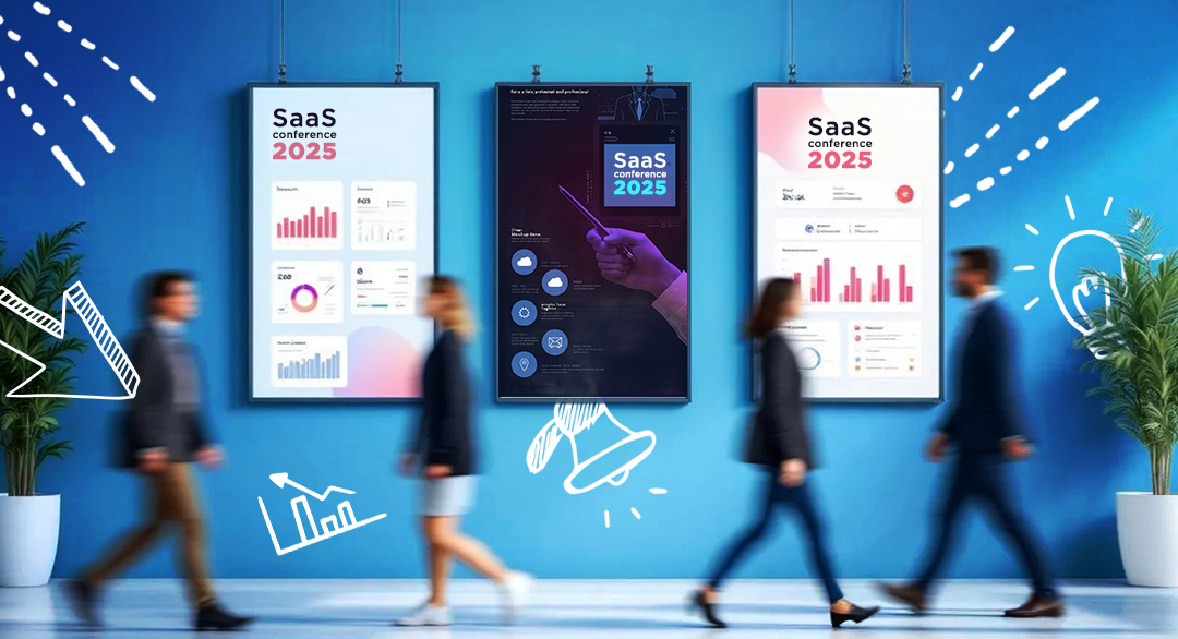

Why Your B2B Event Print Materials Are Sabotaging Your Lead Generation (And How to Fix Them)
The $50,000 Booth with $5 Collateral
Picture this: You've just dropped $50,000 on a prime booth spot at SaaS Connect. Your demo screens are crisp, your booth design is on point, and your sales team is ready to crush it. Then someone asks, "Did anyone design the handouts?"
Cue the panic.
Suddenly, your marketing coordinator is frantically trying to update last year's product sheet in Canva at 11 PM, two days before the event. The result? Pixelated logos, mismatched fonts, and copy that reads like a technical manual from 1995.
Here's the brutal truth: Your first impression isn't your product demo or your elevator pitch. It's that piece of paper someone picks up from your booth.
After working with hundreds of B2B tech companies on their event materials, I've seen this scenario play out more times than I can count. Companies that spend months perfecting their positioning and messaging completely phone it in when it comes to print design. And it's costing them deals.
Why Print Still Rules in a Digital World
"But isn't print dead?" you might ask. "Shouldn't we focus on our digital presence?"
Here's what every B2B marketer needs to understand: At in-person events, print is your secret weapon precisely because everyone else is going digital.
Think about the last conference you attended. How many booths had giant LED screens, tablet demos, and QR codes linking to digital experiences? Probably most of them. Now think about which booths you actually remembered two weeks later.
I'll bet it wasn't the ones with the flashiest screens.
The Psychology of Physical Materials
There's actual science behind why print works. A 2023 study by the United States Postal Service found that physical materials are 34% more memorable than digital advertising and engage multiple areas of the brain related to long-term memory and emotional response.
But here's what the research doesn't tell you: Print works because it forces you to be clear.
When you have unlimited digital real estate, it's easy to cram everything onto a webpage. But when you're designing a one-page handout, every word matters. Every visual element has to earn its place. The constraint forces clarity, and clarity sells.
I worked with a cybersecurity startup that was struggling to explain their threat detection platform. Their website had seven different value propositions, four product modules, and enough technical specifications to choke a CISO. But when we distilled their message down to a single-page handout, something magical happened.
One line: "Stop explaining why the breach happened. Start preventing it from happening."
That line, on a clean, professionally designed handout, generated more qualified leads at one conference than their previous three events combined.
This is exactly the kind of strategic print design we help B2B companies execute through our Print Design Servicesturning complex messaging into clear, conversion-focused materials.
The Event Materials That Actually Move the Needle
Most companies approach event print like they're opening a paper goods store. They print everything: brochures, spec sheets, case studies, company overviews, product catalogs, and probably a few things they forgot they had.
This is exactly backwards.
The best event materials follow the same principle as good design: Less is more, but better.
The Essential Print Kit That Actually Works
After analyzing the event materials of our highest-performing clients, here's what actually drives results:
The Hero One-PagerThis is your workhorse. One page, benefit-driven, designed to be understood in 30 seconds or less. Not a product spec sheet. Not a company overview. A clear statement of the problem you solve and why someone should care.
Strategic Booth SignageYour booth graphics aren't wallpaper. They're billboards. Big, bold, and impossible to misunderstand. The best booth signs we've designed can be read and understood from 20 feet away by someone walking past with coffee in one hand and their phone in the other.
Conversation StartersSmall, focused pieces that give your sales team something to hand over during conversations. Think demo recap cards, ROI calculators, or implementation timelines. These aren't meant to be comprehensive. They're meant to extend the conversation beyond the booth.
The Follow-Up WeaponHere's where most companies completely drop the ball. They collect 200 business cards, send generic email follow-ups, and wonder why their conversion rates are terrible. Smart companies design follow-up print pieces that arrive in the mail two weeks post-event. A simple, well-designed piece that says "Great meeting you at [Event]" with a clear next step.
What You Absolutely Don't Need
Generic Company Brochures: Nobody cares about your founding story or your office locations. They care about their problems.
Technical Specification Sheets: Save the API documentation for the technical evaluation phase. Your booth handout isn't the place for architectural diagrams.
Everything Else From Your Website: Your event materials aren't your website printed out. They're a curated selection of your most compelling messages, designed for a specific context.
I once had a client show up to an event with fourteen different handouts. Fourteen. Their booth table looked like a newsstand. When I asked which piece someone should pick up first, they couldn't give me a straight answer.
We redesigned their entire approach around three pieces: one hero handout, one demo recap card, and one follow-up mailer. Their lead quality improved by 300%.
The Design Principles That Separate Winners from Wannabes
Here's what separates professional event materials from the amateur hour stuff that gets tossed in conference center trash cans:
Hierarchy Is Everything
Your handout isn't a novel. People are going to scan it while standing up, probably while distracted by booth noise and other conversations. That means you have about three seconds to communicate your core message.
The Three-Second Rule: Someone should be able to pick up your handout and understand what you do and why they should care in three seconds flat. If it takes longer than that, you've lost them.
This means your headline needs to be bold and benefit-focused. Your subhead needs to add clarity, not repetition. And your body text needs to be scannable, not a wall of corporate speak.
White Space Is Your Friend, Not Your Enemy
The biggest mistake I see in B2B event materials is the fear of white space. Companies think that if they're paying for printing, they need to fill every square inch with content.
This is design suicide.
White space doesn't cost extra. But it does something invaluable: it makes your content breathable and digestible. It guides the eye. It creates emphasis. It makes your materials look professional instead of desperate.
I redesigned a handout for a logistics software company that had crammed their entire value proposition, three case studies, a product overview, and their contact information onto a single page. The result looked like a ransom note.
We stripped it down to one clear headline, three bullet points, one compelling statistic, and a simple call-to-action. The rest was white space. Their booth traffic increased by 40% the next quarter.
Consistency Builds Trust
If your booth banner, handouts, and giveaways all look like they came from different companies, you're confusing your prospects. And confused prospects don't buy.
Brand consistency isn't about being precious about your logo. It's about building trust through visual coherence. When all your materials look like they belong to the same family, you look professional. When they don't, you look scattered.
This means using the same fonts, colors, and design style across all your event materials. It means making sure your handout design language matches your booth design language. It means thinking about how all these pieces work together to tell a cohesive story.
The Most Expensive Mistakes We Fix
After years of rescuing botched event materials, I've seen the same expensive mistakes over and over again. Here are the big ones:
The Last-Minute Scramble
The Mistake: Starting your print design the week before the event.
Why It Kills You: Rushed design means unclear messaging, off-brand visuals, and missed opportunities to align your materials with your overall event strategy.
The Fix: Start your print design process 4-6 weeks before your event. This gives you time to think strategically about what you actually need, get proper approvals, and make revisions based on feedback.
The Everything Bagel Approach
The Mistake: Trying to communicate every possible value proposition, use case, and product feature in your event materials.
Why It Kills You: Information overload leads to message confusion. When everything is important, nothing is important.
The Fix: Pick one primary message for your event materials and design everything around that. If you absolutely must communicate additional information, create separate, focused pieces rather than cramming everything together.
The Brand Frankenstein
The Mistake: Having materials that sort of look like your brand but not quite.
Why It Kills You: Inconsistent branding makes you look unprofessional and undermines the credibility you're trying to build.
The Fix: Create a simple brand guidelines document specifically for event materials. Include approved fonts, colors, logo usage, and layout templates. Share this with anyone who might be creating materials.
The Quantity Over Quality Trap
The Mistake: Printing 5,000 handouts because the per-unit cost is lower.
Why It Kills You: You end up with boxes of unused materials and no budget for quality design or paper stock.
The Fix: Print smaller quantities of higher-quality materials. It's better to have 500 pieces that look professional than 5,000 pieces that look cheap.
The Paper Quality Blind Spot
The Mistake: Assuming paper stock doesn't matter.
Why It Kills You: Flimsy, cheap paper makes your company look flimsy and cheap. The tactile experience of your materials creates an immediate impression about your brand quality.
The Fix: Invest in good paper stock. The difference in cost is minimal, but the difference in perception is massive.
The Strategic Approach That Actually Works
The companies that dominate at events don't just show up with better materials. They show up with a better strategy. Here's the framework that consistently produces results:
Phase 1: Define Your Event Objectives
Before you design a single handout, get clear on what you're trying to accomplish. Are you generating awareness for a new product? Collecting leads for enterprise sales? Recruiting partners? Your materials strategy should align with your event strategy.
Phase 2: Audience Audit
Who's going to be at this event? What do they care about? What problems keep them up at night? Your materials need to speak directly to the people who will be walking past your booth, not to some generic B2B buyer persona.
Phase 3: Message Hierarchy
What's the one thing you most want people to remember about your company? That's your primary message. What are the 2-3 supporting points that reinforce that message? Those are your secondary messages. Everything else is tertiary and probably doesn't belong on your main handout.
Phase 4: Materials Architecture
Map out which materials serve which purposes. Your booth signage creates awareness and draws people in. Your hero handout communicates your core value proposition. Your conversation starters give your sales team tools to extend discussions. Your follow-up pieces keep you top-of-mind post-event.
Phase 5: Design Execution
This is where most companies start, but it should be step five, not step one. By the time you get to design execution, you should know exactly what you need to create and why.
Phase 6: Quality Control
Print proofs. Check them under different lighting conditions. Get feedback from people who weren't involved in the design process. Make sure everything aligns with your brand guidelines and your event objectives.
The Follow-Up Strategy Nobody Talks About
Here's something that will separate you from 95% of your competitors: Design your follow-up strategy before the event, not after.
Most companies collect business cards at events, then send generic email follow-ups that get ignored. The smart companies create a multi-touch follow-up sequence that includes strategically designed print pieces.
The 2-Week Follow-Up Mailer
Two weeks after the event, while other companies are still sending generic "nice to meet you" emails, you send a physical mailer. Nothing fancy. Just a simple, well-designed piece that references your conversation and includes a clear next step.
Why This Works
Physical mail has an open rate of nearly 100%. Your email might get lost in an inbox, but a well-designed mailer will get looked at. And in a world of digital overwhelm, the tactile experience of opening an envelope creates a moment of focused attention.
I worked with a marketing automation company that implemented this strategy. Their post-event conversion rate went from 3% to 18% just by adding a simple follow-up mailer to their sequence.
The Thank You Package
For your highest-value prospects, consider sending a small thank you package 30 days post-event. This isn't about expensive gifts. It's about thoughtful presentation. A simple notebook with your branding, wrapped well, with a handwritten note.
The ROI of Getting This Right
One client calculated that their improved event materials strategy generated an additional $2.3 million in pipeline over six months. Not because they spent more money, but because they spent it more strategically.
The Production Reality Check
Let's talk about the practical side of getting this done. You've got deadlines, budget constraints, and probably fifteen other projects competing for your attention.
Timeline Planning
6 weeks out: Define your event strategy and materials needs4 weeks out: Complete initial design concepts3 weeks out: Final design approval and print preparation2 weeks out: Materials printed and shipped1 week out: Final quality check and booth setup planning
Budget Allocation
Stop thinking about print as a line item expense. Think about it as an investment in lead generation. A well-designed handout that costs $2 per piece but generates qualified leads is infinitely more valuable than a cheap handout that gets thrown away.
Quality vs. Speed Trade-offs
If you're in a time crunch, prioritize your hero pieces. It's better to have one perfectly executed handout than five mediocre ones. You can always create additional materials for future events, but you only get one chance to make a first impression.
The Competitive Advantage Nobody Sees Coming
Here's what most B2B companies miss: Your event materials are often the only marketing touchpoint where you have complete control over the experience.
Your website competes with browser tabs and notification pop-ups. Your emails compete with inbox clutter. Your ads compete with every other ad on the platform.
But your event handout? That's a captive audience moment. Someone has picked up your material because they're interested. They're giving you their focused attention for 30-60 seconds. Don't waste it.
The Compound Effect
Great event materials don't just generate leads at the event. They create a halo effect that extends far beyond the conference hall:
- Sales enablement: Your sales team has professional materials to leave behind during follow-up meetings
- Brand perception: Consistent, high-quality materials reinforce your positioning as a serious player
- Content multiplication: Well-designed templates can be adapted for other events, saving time and maintaining consistency
Making It Happen (Without Losing Your Mind)
You're convinced that better event materials matter. But you're also realistic about the constraints you're working within. Here's how to make it happen:
The DIY Approach
If you're handling design internally, invest in good templates and stick to them religiously. Consistency beats creativity when you're working with limited design resources.
The Hybrid Approach
Outsource the strategy and initial design, then handle variations and updates internally. This gives you professional quality with ongoing flexibility.
The Full-Service Approach
Partner with a team that understands B2B marketing and can handle your print design needs. This is the highest investment upfront but often the lowest total cost when you factor in time and opportunity costs.
The Bottom Line on Print That Performs
Your event materials are sales tools, not corporate brochures. They should be designed to start conversations, not end them. They should make your sales team's job easier, not harder. And they should reinforce your positioning, not confuse it.
The companies that win at events understand something fundamental: Every touchpoint is a chance to build trust or erode it. Your booth design, your demo, your follow-up emails, and yes, your print materials all contribute to the overall impression you make.
In a world where everyone's trying to stand out with bigger screens and flashier demos, sometimes the most effective strategy is the simplest one: Clear message. Professional design. Quality execution.
That's not revolutionary. But it works.
And in B2B sales, working is better than revolutionary every single time.
The Reality Check
Your next event is probably coming up faster than you'd like. Your materials probably need more work than you have time for. And your budget probably has more constraints than you'd prefer.
That's the reality of B2B marketing.
But here's what's also reality: The companies that consistently outperform at events are the ones that treat every detail like it matters. Because in B2B sales, trust is built one impression at a time.
Your print materials are one of those impressions. Make them count.
