

Most B2B marketers are great at strategy, but giving design feedback can be tricky. This often leads to frustrated designers, misaligned work, and wasted time. This guide will help you give feedback your design team understands and wants to use. We’ll share real examples, stories from our experience, and tips from working with dozens of SaaS and B2B marketing teams. You’ll learn how to turn vague feedback into clear direction and better results.
Let’s be honest: Design feedback is often a mess
Picture this familiar situation.
You have a campaign going live in two days.
You finally get the design back.
It’s… okay. But not quite there.
You reply with something like:
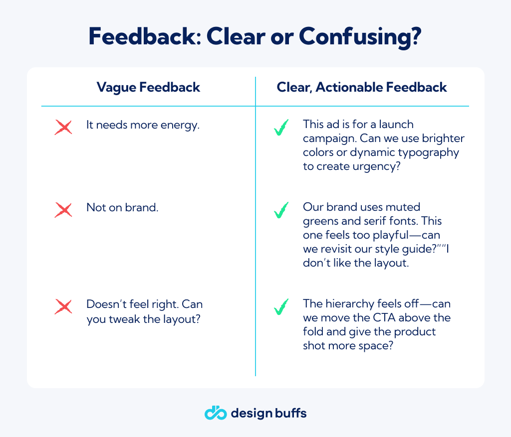
- “Can we make it pop more?”
- “Feels off-brand.”
- “Just not hitting the mark.”
And then… radio silence from your designer. Or worse: a completely different version that misses the point again.
Sound familiar? We see this a lot at Design Buffs. It’s usually not about a lack of care or talent, but rather unclear, gut-feeling feedback.
Now that we know where the process often goes wrong, let’s look at what makes feedback actually work. Key takeaway: Clear, actionable feedback reduces frustration and leads to better outcomes.
The #1 Rule: Feedback isn’t taste—it’s translation
Here’s a hard truth: Your personal preferences aren’t feedback.
“Make it bolder” or “I don’t like that blue” might be feelings, but they don’t help a designer understand why something isn’t working.
Instead, try to see feedback as a way to turn your marketing goals into clear visual direction. Help your designer understand the purpose of the piece, who it’s for, what feeling you want to create, and what action you want the audience to take.
Here’s a side-by-side:
Real talk from the trenches: A Slack DM that taught me everything
A few years ago, I was managing a big content refresh project. Our internal designer had just sent through a blog graphic for a high-value post. I DM’d her:
“Hey, not loving the vibe. Can you make it feel more 'premium'?”
To her credit, she didn’t bite. She wrote back:
“Hey! What does premium mean to you? Do you mean color, typography, layout, imagery?”
That message made me realize I often gave vague feedback, expecting designers to read my mind. After that, I started describing what I meant. Now, let's break down five types of useful feedback, each with real examples to give your designer clear guidance.
1. Goal-Based Feedback
Start by stating the asset’s purpose. Designers may not know the campaign context.
Instead of:
“This doesn’t work.”
Try:
“This landing page is meant to convert cold traffic into free trial signups. Right now, the CTA blends in—can we test a bolder color or bigger size to draw more attention?”
Tie-in:
When onboarding, we ask: What’s the goal? If designers guess, it’s expensive.
2. Audience-Based Feedback
Who is the design for? Each audience needs a different tone and style.
Instead of:
“Feels too young.”
Try:
Our target here is a CIO. Let’s avoid using too young and playful elements. Instead, focus on clean lines and the absence of gradients.
Pro tip: Share examples. Screenshots often say more than words and can help convey your feedback more effectively.
Instead of:
“It’s a bit messy.”
Try:
The main message needs to be clear within three seconds. If not, say what needs fixing or what emotion you want the design to evoke.
Instead of:"Too corporate."”
Try:
This campaign is for a bold product launch: we want it to feel confident and spirited. Use examples or visuals to clarify as words like "bold" or "edgy" mean different things. Copy and design should align to avoid audience confusion.
Instead of:
“This image feels random.”
Try:
The copy talks about simplifying complex systems. Could we use visuals that reflect this? Bonus: Give designers final copy before they start. It makes designs more precise, even on tight timelines.
What not to do: The “Kitchen Sink” Review
There’s a tendency—especially in group settings—to list every possible tweak in one go:
- “Can we change the font?”
- “Let’s try a different color.”
- “Maybe we try a version with no image?”
- Better approach: Start with high-level alignment. Focus on what’s not working and why. Only move to tweaks once you’ve agreed on direction. The key takeaway: Clarity and prioritization save time and lead to stronger outcomes; always align on direction first for best results.
Should You Use Annotations, Loom, or Text? Depends.
Some people love Loom videos. Others prefer bullet points in Notion. Here’s our take:
Loom: Nuanced, emotional tone or walking through flow. Keep it under 3 mins. Be specific.
Annotated PDFs / Screenshots: Layout, spacing, hierarchy feedback. Use arrows and comments clearly.
Text (Slack, Notion, Email): Simple direction or quick rounds. Bullet points. Use examples. Prioritize issues.
At Design Buffs, we allow clients to add notes directly in our project dashboard or send a Loom video if they prefer. Being efficient matters, but being clear is even more important.
Good Feedback Doesn’t Mean Positive Feedback
Your job isn’t to flatter the designer. It’s to help them hit the mark. That sometimes means being blunt. Just… be respectful.
Bad:
“This is wrong.”
Better:
“This isn’t aligned with the brief. The illustration style feels off-brand. Designers don’t need praise. They need direction. The main takeaway: Useful feedback is actionable, not just positive.the moodboard and reframe the hierarchy?”
Designers don’t need praise. They need direction.
The 3 Golden Rules for Feedback That Gets Results
- Be timely – If you wait too long to give feedback, it loses its impact. Be collaborative – Treat feedback as a shared goal, not just a demand. The best feedback is quick, focused, and works toward a common goal.
- Be collaborative – Frame your feedback as a shared goal, not a demand.
What great design feedback sounds like (real client example)
From a B2B SaaS client of ours:
"Hey team, love where this is headed. The goal is to convert leads from our whitepaper into a product demo, so the CTA needs to feel more action-oriented. Can we try more assertive copy and a stronger button treatment? Also, our VP of Marketing prefers visuals that reference real tech environments—less abstract art."
The client’s feedback highlights a real-world example of transforming general suggestions into specific guidance. Giving clear, actionable feedback is a skill you can train. Key takeaway: Practice and intention will make your feedback more effective for everyone involved.
Your designers can’t read minds. They rely on your clear strategy, goals, and respectful direction to do their best work. Key takeaway: Consistent, thoughtful feedback empowers designers to deliver their strongest work.
If you ever feel overwhelmed by revisions or stuck in a feedback loop, that’s exactly why we created Design Buffs. Our subscription model helps you work with designers as if they’re part of your own team, not just freelancers.
Ready to cut feedback cycles and deliver results faster? Let’s get your design workflow working for you.
Book your free 20-minute call now to discover how we help B2B teams simplify feedback and get standout creative, starting today.
See how our Marketing Design Services can instantly become your creative team’s advantage—explore our offerings now.
